Curator
Curator, a tool within NYT's proprietary CMS, allows editors to plan, build and publish the web home page and the mobile app home feed of The New York Times, including our algorithmic home page experiments.
CURATOR
Curator, a tool within NYT's proprietary CMS, allows editors to plan, build and publish the web home page and the mobile app home feed of The New York Times, including our algorithmic home page experiments.
̌

I was the solo founding designer of NYT’s publishing tool “Curator”, which allows editors to plan, build and publish the home page, replacing the long standing tool “List Collections.” Curator was a new CMS approach implemented for the home page that allows for greater flexibility on the editor side, leading to a more personalized experience for our reader base.
In The Beginning…
Prior to Curator, home page editors had been using a feature in our proprietary CMS (“Scoop”) called “List Collections.” The antiquity and rigidity of this tool was starting to present problems on many fronts:
Tech problem: The existing tool was in a codebase we could no longer maintain without introducing bugs.
Business problem: Because of the rigidity of the system, we had no way of sending out personalized content and no differentiation between mobile and desktop experiences.
User problem: The outdated interface had so many quirky nuances that onboarding new Home Team editors presented large cognitive overhead and overall slow production times, regardless of the level of expertise.
Additionally, inserting an image into the home page took you OUTSIDE of List Collections into another tool. Crazy!

In the beginning, we had “List Collections.” It was … not great.
First Stop: The Newsroom
To get a complete understanding of the challenges editors faced when producing the home page, I conducted interviews with various home page editors. In addition, I shadowed them on their shifts and created user flows of their workflow.
Editors were using multiple tools to complete one task and getting a story on the home page required an insane daisy chain of tools (including physical paper).
Imagine doing this in a breaking news environment … yikes.

A snippet of a much longer user flow.
Facts and Assumptions
What we knew: We needed to have a fully flexible home page, with a variety of moveable templates and the ability to publish various versions of the homepage to target specific demographics.
Design perspective: Form fields vs. WYSIWYG: As Design Lead, I thought the best approach would be to design our new CMS tool as form fields. Although WYSIWYG had been considered, form fields seemed like the best initial approach as we’d have ultimate flexibility if we needed to move blocks of content around on the page from a tool perspective, and by keeping us “layout agnostic,” we wouldn’t be beholden to any changes made to the reader facing design.
Engineering perspective: Form fields would be a low lift, allowing for quick testing, iterations and a clean codebase to grow from.

Competitive Analysis
Knowing that we would be pursuing a flexible form based platform, I began a competitive analysis of other external tools that dealt in form field based blocks of content that were also moveable and flexible. I looked at tools such as Trello, Hootsuite and JIRA to name a few. Why these tools?:
The information is inputted in a form field method.
You can easily move content around on the page (should we ever decide to try swapping section placements).
You can “zoom in” on items (for looking at the specific details of an article) and “zoom out” (if you want to look at the big picture - ie. all articles currently up on the homepage).
Post competitive analysis: I ran a workshop with my fellow publishing designers and various newsroom liaisons to do some rough first-pass paper sketches of how this new product could look and feel. Sketches were based on initial newsroom requirements and information provided from my competitive analysis.

Wireframes and Prototypes and Testing (oh my!)
From there I began to work on rough wireframes in Figma with the intended MVP goal of matching functional parity with “List Collections” in Scoop. Matching parity as our MVP goal would allow us to eventually deprecate “List Collections” (which we successfully did in the early spring of 2020).

Wireframes and prototypes were consistently put in front of various home page editors for feedback and testing. One example was a prototype built that was put in front of a group of editors. They were presented with a list of tasks to complete. The feedback we gathered, such as unclear iconography and tool tips preferences, helped drive where I landed on future high fidelity designs.

The low fidelity prototype was an opportunity to get early fast feedback from newsroom so we could answer questions before getting into high fidelity when it's more "expensive" to pivot.
Final Steps
Once high fidelity designs for our MVP of matching “List Collection” parity were engineering-ready, our first testing ground was with the home page section of Editors’ Picks. Why this section?:
Low stakes with this section as it tends to contain more evergreen content.
Editors’ Picks only contain three stories maximum.
Editors’ Picks have timed page flips (6am, 12pm and 6pm).
We ran a test publish with the editor of Editors’ Picks in the Fall of 2019 with success and positive feedback in regards to ease and feel of our new tool.
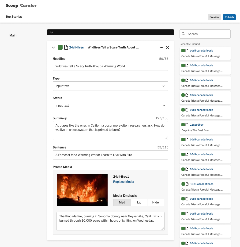
High fidelity Curator!
THE BIG WIN! (and some other wins, too)
THE BIG WIN: From there through the spring of 2020, we began to move other sections of the homepage on to Curator, enabling us to have a full deprecation of “List Collections” in the spring of 2020.
The ability to build packages and to switch promo images within Curator itself (no more being redirected out to another tool).
The ability to send an alert to Slack from within Curator with preview copy and a link to the section for approval and/or edits.
And our team won a NYT Publisher's Award for Curator! 🎉