DASH
DASH is Refinery29’s proprietary Content Management System (CMS). A publishing tool built in-house, DASH brings in analytics and machine assisted content creation to help make the story editing process and tracking business goals more efficient throughout the company.
DASH
DASH is Refinery29’s proprietary Content Management System (CMS). Built in-house, DASH brings in analytics and machine assisted content creation to help make story editing, publishing and business goal tracking more efficient throughout the company.
̌
DASH…more than just your average CMS!
DASH is comprised of several technology assets built from the ground up that support our growth as an international business and are easily adaptable as we continue to become a multi-region and multi-language media company. Currently there are 500+ daily active users of DASH across the company.
Contributor & User Management Project
During the launch of our permissions project, we ran into an obstacle: how do we unify users and contributors in DASH? The main issue was that there wasn’t a way to associate a user and a contributor to indicate that they are the same person.
Glossary
CONTRIBUTOR- a contributor is created to add person to a list of bylines. These people do not have DASH access.
USER- a user is created in DASH as someone who has access to the CMS.
Old Contributor Management UI
Old User Management UI
Objective
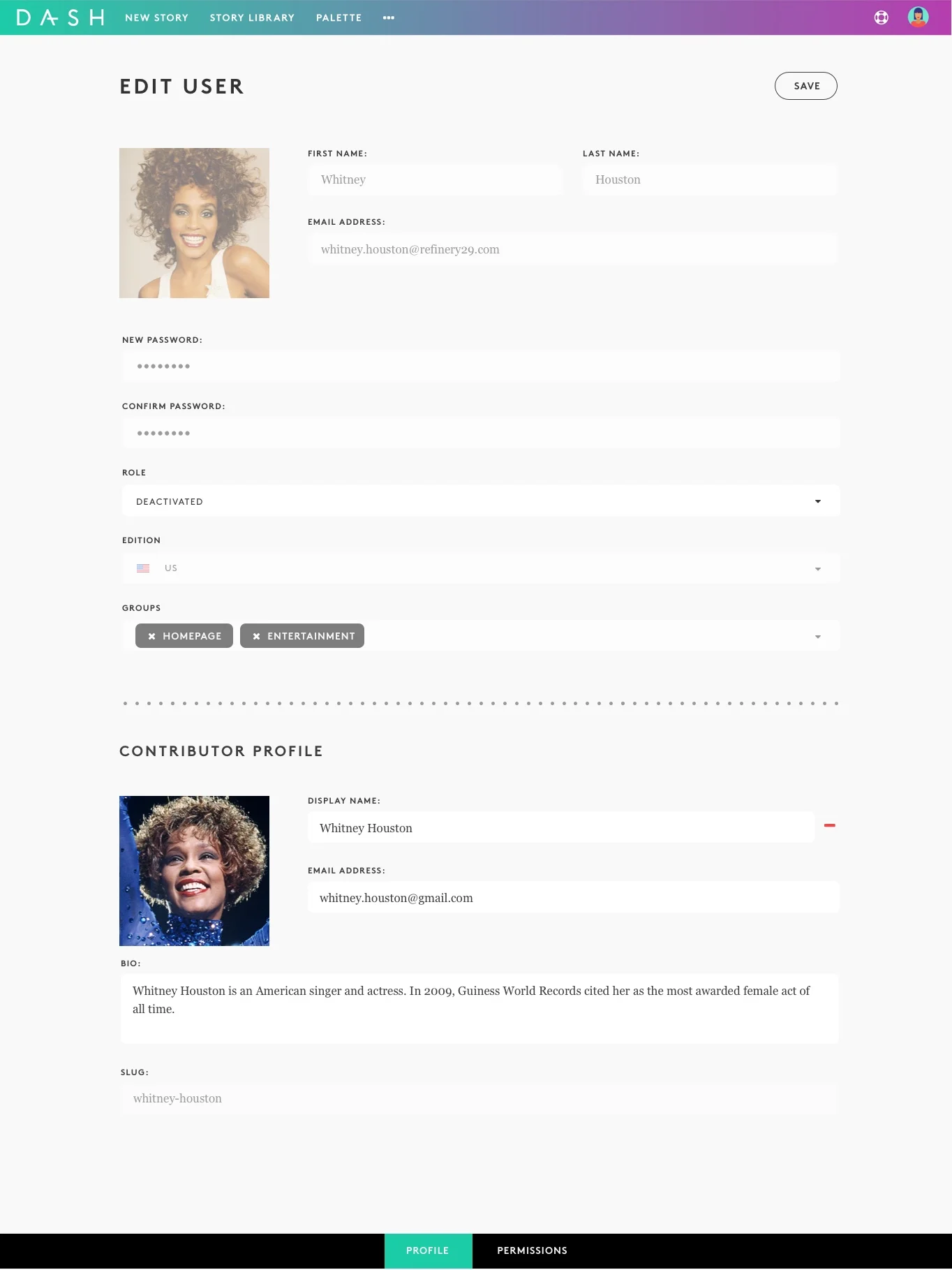
To implement a system where we are able to understand a user’s full participation in DASH, unite their profiles and lay the foundation to build personalization and tools on top of it.
Considerations
A user needs to be able to exist without a contributor. A contributor needs to be able to exist without a user. The two need to be able to exist with each other.
We will need to be able to remove users without removing their contributor profile, and vice versa.
User Flows & Testing
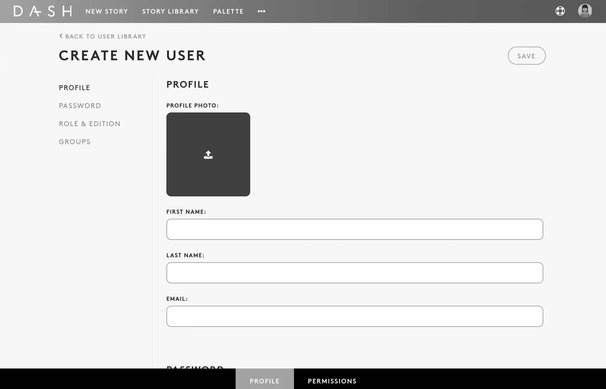
We identified two potential UIs that we were interested in exploring and testing.
Unity! As one stand together!
You gotta keep 'em separated
The user base for our management system is comprised of two main user groups: Editors (who onboard Contributors, a.k.a. Writers) and our IT department (who onboard Users, a.k.a. full-time hires).
I decided to run a first-click test on wireframes for the Option 1 flow, and the resulting outcome showed that our first flow wasn’t as clear cut as we thought. The question was, “Where would you click to add a new User?”
“Where would you click to add a new User?”
In the meantime, the developer for our project conducted their own research and found that the Option 1 approach would be complicated because of the URL structure. We would have to create a new parent URL structure because there isn’t a way to have both a user and a contributor exist under the same URL.
The combination of this finding and the Option 2 test performing FAR better led us to begin iterating on mocks based on elements of the second user flow.


